Introduction
You’ve got a killer idea and a small, scrappy team. You’re sprinting toward launch, focused on shipping features, securing funding, and gaining early traction. But in that whirlwind, it’s easy to overlook your users.
UX – or user experience – is one of the most common casualties in early-stage startups. And the consequences are costly: users leave, engagement drops, and your product stalls.
In this guide, we’ll walk through the top 10 UX mistakes startups make and share how to avoid them using practical, budget-friendly solutions. Whether you’re building a SaaS app, mobile product, or eCommerce platform, these tips will help you stay aligned with your users, even when time and money are tight.
✨ Bonus: Download our free UX Audit Checklist to review your product today.
Note: The case studies below are illustrative, based on real-world startup scenarios.
1. Designing for Investors, Not Users
Startups often build with pitch decks in mind, adding flashy features to impress investors. The problem? Those features rarely help real users.
🎯 Fix: Center your design process around your users. One meal delivery startup created a homepage filled with investor-focused metrics. After user interviews, they simplified the layout to highlight quick sign-ups and core benefits, which boosted conversions by 25%.
🛠️ Tip: Use free tools like Google Forms to gather honest user feedback.

2. Skipping User Research
“Everyone will love this!” is a common founder mindset, but without speaking to users, it’s easy to solve problems that don’t exist.
🎯 Fix: Even lightweight research works. A gym management SaaS assumed that gym owners cared most about tracking attendance. However, a quick Typeform survey showed they prioritized retention tools instead. That pivot doubled user satisfaction.
🛠️ Tip: Start with five user interviews, which will be enough to uncover 80% of usability issues (Nielsen Norman Group).

3. Overcomplicating the Interface
Startups often keep adding features without removing anything, creating a bloated, confusing interface.
🎯 Fix: Simplify. One eCommerce setup platform overloaded users with toggles and options. Usability testing via Lookback showed users wanted a streamlined flow. Trimming features improved Onboarding by 20%.
🛠️ Tip: Use Lookback or Maze to watch how users interact with your interface.

4. Ignoring Mobile Optimization
In 2024, over 60% of web traffic came from mobile (Statista). Poor mobile UX kills conversions.
🎯 Fix: Design mobile-first. A finance app had beautiful desktop flows but clunky mobile screens. After redesigning with thumb-friendly buttons and reducing page weight, mobile retention jumped 30%.
🛠️ Tip: Use BrowserStack to test across devices without buying them all.
5. Neglecting Onboarding
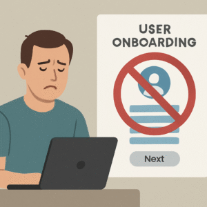
You’ve built a powerful product, but if users don’t know how to use it, they’ll leave.
🎯 Fix: Guide users gently. A project management startup reduced churn by 15% after adding a simple 3-step onboarding tour using contextual tips.
🛠️ Tip: Tools like Appcues or Userpilot make it easy to create no-code onboarding flows.
6. Confusing Navigation
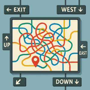
Menus should help people find things, not leave them guessing.
🎯 Fix: Organize content around user needs. An online clothing store saw bounce rates spike due to overlapping categories. After tree testing with Optimal Workshop, they restructured the menu and saw a 10% drop in bounces.
🛠️ Tip: Run a card-sorting test with users before finalizing your menu.
7. Inconsistent Visual Design
Mixed fonts, clashing colors, and inconsistent buttons create confusion and reduce trust.
🎯 Fix: Build a design system. A B2B payments app increased conversions by 12% after unifying styles across pages.
🛠️ Tip: Start with Figma’s free UI kits to stay consistent from the beginning.

8. No Feedback on User Actions
If a user clicks and nothing happens, they assume it’s broken — even if it’s just slow.
🎯 Fix: Add feedback for every interaction. A payment system reduced errors by 18% after adding loading spinners and confirmation messages.
🛠️ Tip: Track where users get stuck using Hotjar’s session recordings.

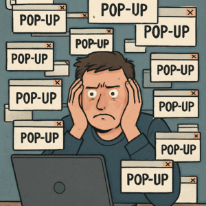
9. Overusing Pop-ups
Pop-ups can be effective, but if they show too early or too often, users leave.
🎯 Fix: Use pop-ups sparingly. An online store switched to exit-intent offers, improving discount conversions by 20% without annoying visitors.
🛠️ Tip: A/B test your pop-up timing with OptinMonster.
10. Skipping User Testing
Building in a vacuum is risky. Just a few user tests can prevent massive post-launch issues.
🎯 Fix: Test early and often. A fitness app caught major friction points in its sign-up flow by testing with 10 early users, which improved satisfaction by 90% at launch.
🛠️ Tip: UsabilityHub offers fast feedback on designs, even from strangers.

Conclusion
You don’t need a huge budget to deliver great UX. Just empathy, consistency, and a willingness to test. Avoid these common mistakes, and you’ll create products that users love — and come back to.
🎁 Download our free UX Audit Checklist to start improving your product today. Or contact our UX team for a free consultation.
Frequently Asked Questions
Q1. What are the most common UX mistakes startups make? Skipping user research, overcomplicating the interface, poor onboarding, and neglecting mobile UX are some of the top mistakes that hurt usability and retention.
Q2. How do I test UX on a limited budget? Use free or low-cost tools like Google Forms, Hotjar, Maze, or UsabilityHub. Even small-scale user testing can yield big insights.
Q3. What’s the best way to fix bad UX in a SaaS app? Start by identifying friction points with real users, simplify key flows, and improve onboarding. Focus on high-impact areas like dashboards and conversions.
Q4. How important is UX for startup success? Critical. Great UX improves retention, lowers churn, and can boost conversions by up to 400% (Forrester).
Q5. Why do startups struggle with UX? Rushed launches, limited research, and prioritizing aesthetics over usability lead to UX failures that could have been avoided.


