What is the SaaS Product's UX Design?
UX design for SaaS dashboards isn’t very different from UX design for any digital product. Good UX always aims to create intuitive and user-centered workflows that help users perform their tasks efficiently and actually enjoy the process within a cloud-based SaaS application. Unlike installable software with specific system requirements, SaaS tools are accessed online like websites, from multiple devices and teams. This means your SaaS dashboard UX must account for:
- Scalability for different user types (admin, team member, analyst, etc.)
- A learning curve that supports first-time and power users
- A clear information architecture with minimal friction
A good UX design ensures that SaaS products are easy to use and, at the same time, habit-forming. Okay, so habit-forming means that we design our SaaS UX and its services to encourage users to return not because they need them, but by choice.
SaaS UX also demands flexibility across platforms and consistency in behavior, especially for multi-user teams. Nielsen Norman Group outlines great fundamentals for designing cloud-based user experiences.
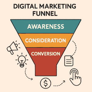
Why Dashboards Are the Heart of a SaaS Product
Every SaaS tool or product not only provides service to its customers but also gives its users the most needed information about its product at a glance. Here, the Product Dashboard comes into focus. A product dashboard is not just a design layout but the first real handshake between your dream product and its users.
The Dashboard is where users go to understand their product insights. It helps them evaluate product values and take further actions to improve product quality and process, reach engagement, and measure progress.
In UX design for SaaS dashboards, the dashboard isn’t just a collection of data; it’s the core of engagement and often the very thing. It often decides whether a trial user of the service will turn into a paying customer or churn.
Many Founders and Product Teams treat making good UX for dashboards as an afterthought. They are more focused on developing features, integrations, and onboarding, and Dashboards become messy dumping grounds of charts, widgets, and irrelevant data that users might rarely want to see and evaluate.
These are some of the most common issues we’ve seen in UX design for SaaS dashboards, and how to fix them.
Common Dashboard UX Mistakes Founders Make
1. Trying to Show Everything at Once
Example:
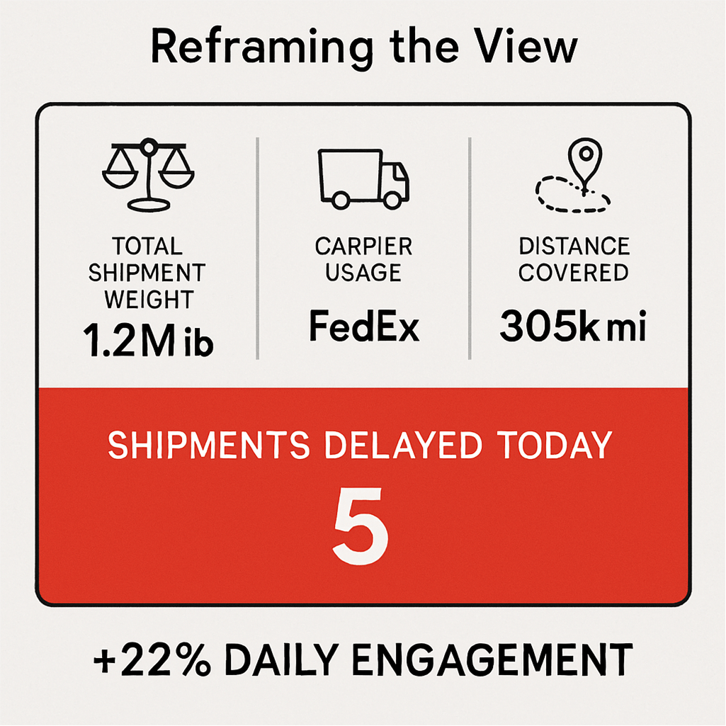
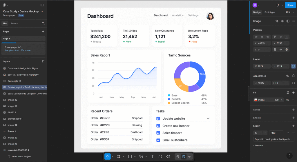
In one logistics SaaS platform, the default dashboard showed “total shipment weight,” “carrier usage,“ and “distance covered.“ But users really needed “shipments delayed today.“ Reframing the view increased daily engagement by 22%.
Founders and even product managers generally think to showcase each and every functionality they have built as key metrics, charts, and shortcuts on the Dashboard to inform the user about their product capability. They also think that if something is built to support the user, what’s the point of hiding it?
This mentality fits from their perspective because they have put a lot of effort into building it, but it is overwhelming for users because that information might not be required at that point; it might be useful in any other scenario.
Imagine logging into a tool and being hit with 10 different charts, 6 callouts, and 4 CTAs. You’re left wondering: What should I do first?
Solution: What to Do Instead?
- Identify one primary action or Insight that matters most to the user by conducting product research and evaluating user feedback.
- Use progressive disclosure to reveal complexity only when needed.
- Apply visual hierarchy to guide attention naturally.
Example: In one logistics SaaS platform, the default dashboard showed “total shipment weight,” “carrier usage,” and “distance covered.” But users really needed “shipments delayed today.” Reframing the view increased daily engagement by 22%.
2. Designing for Features, Not User Behavior
This is a classic misstep. Suppose your Product Dashboard is designed around your product’s functionalities and internal structure without understanding how your users will think and use it. What will they feel when finding the required Insights among other less important data and insights becomes hard?
A user-first approach is crucial in dashboard design. Every user logs in with goals and wants to see that information; they have not come to test and admire your architecture and UI design.
What to Do Instead:
- Map out user journeys and jobs to be done
- Prioritize actionable insights over vanity metrics
- Highlight quick wins: what can the user do right now?
Example:
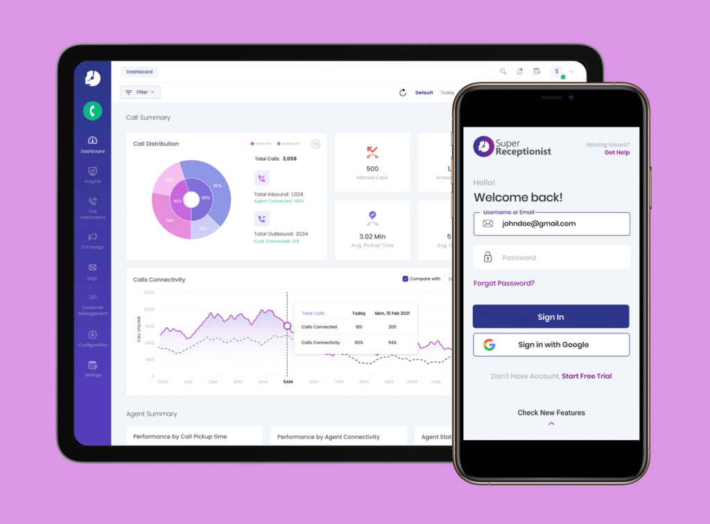
We helped a B2B Cloud Telephony Platform, Knowlarity, redesign its entire product, including the Dashboard. The original product shows configuration steps, logs, etc., on the Dashboard, but users need to know how many calls the system has placed with Inbound and Outbound Call distribution. After redesigning with this focus, sales reps saved 5–7 minutes per login.
3. Lack of Visual Hierarchy
In UX design for SaaS dashboards another common myth is making clean UI with lots of white space and uniform sections, automatically means good UX. But in reality, clean design alone isn’t enough to help users achieve their goals. When dashboards lack visual hierarchy, users don’t know where to focus especially when they’re under pressure or short on time.
What to Do Instead:
- Use size, color, and spacing to draw attention to priority items.
- Group related elements into clear sections or cards.
- Avoid dumping unrelated stats in one block.
4. No Empty States or Feedback
No data? It could be a technical issue, or the data might not be ready. Dashboards often feel broken during a user’s first few sessions when there is no content or Insight available. This leaves users confused, or even worse, they may think the product isn’t working.
What to Do Instead:
- Design for empty states and use them to onboard, educate, and inspire action.
- Include microcopy that explains what to expect next.
- Show loading animations or subtle feedback to confirm interaction.
Example: In an HR SaaS product, the team replaced an empty org chart with a message: “Start by adding your first team member.” Sign-ups that reached this screen converted 14% better.
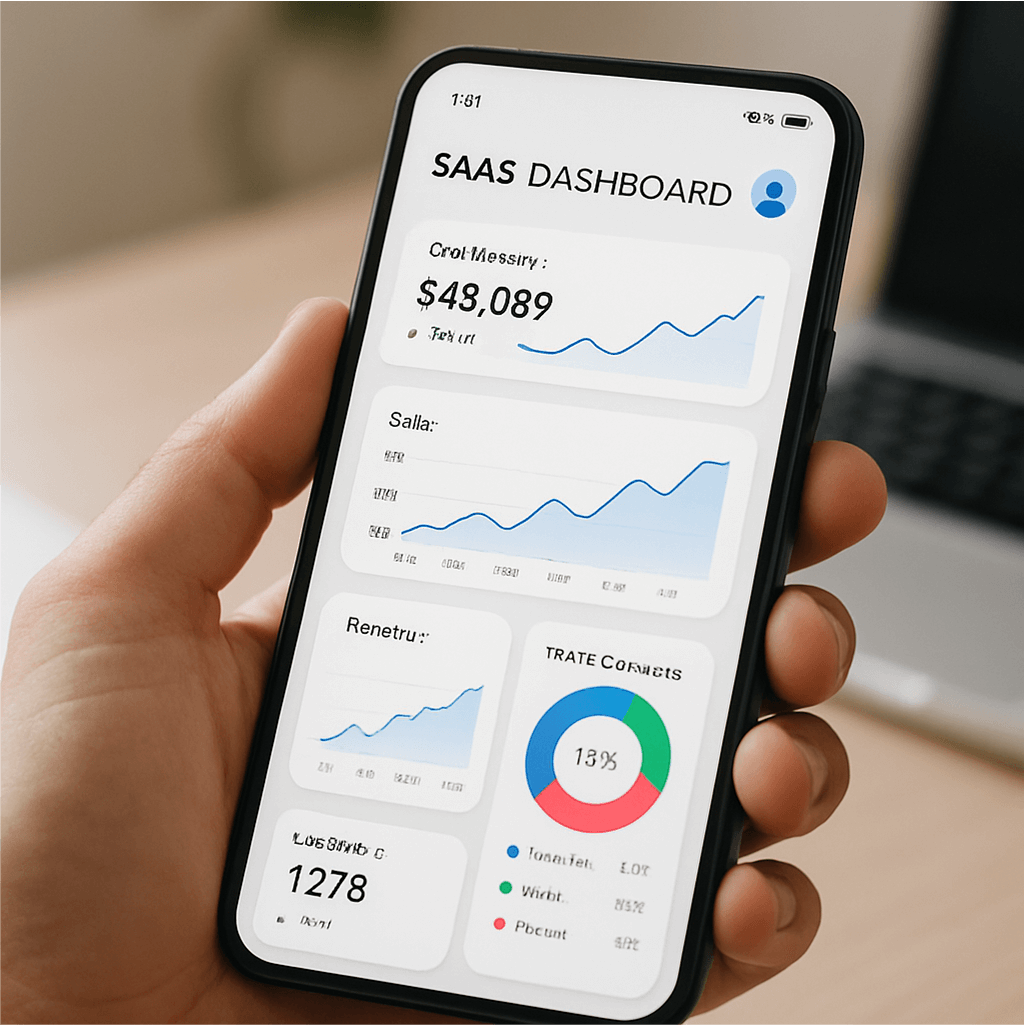
5. Forgetting Mobile Experience
So if your SaaS product isn’t mobile-first, it will badly impact your product growth. Nowadays we know how crucial it is to make any website or product mobile-friendly. Almost every user using a digital product is a mobile user. Maximum product companies are focusing on a Mobile 1st approach for their products. Your product users also expect to be able to check core functionality on the go.
Yet many product dashboards are designed only for widescreen monitors, causing broken layouts or horizontal scroll issues on mobile.
What to Do Instead:
- Audit your Dashboard on mobile before every release.
- Identify 2–3 key actions users should be able to complete via phone.
- Optimize tap areas, font sizes, and collapsible menus.
💡 Tip: You don’t need to replicate the full desktop experience. Prioritize mobile micro-tasks, such as checking today’s metrics or approving a request.
Best SaaS Dashboard UI Examples for Inspiration
We have discussed Dashboard UX a lot above. You might want to look at how great SaaS tools’ UX looks in the real world. We have shortlisted a few examples of SaaS tools for you to get some inspiration, along with mentioning why they are good in their product segments:
- Notion: Clean, minimal interface with quick access to recent pages, team updates, and shared content, all customizable.
- Figma: Their project dashboard shows you the most relevant files first, along with smart folders and quick actions.
- Linear: Prioritizes speed, shortcuts, and clean issue tracking with a logical layout that feels effortless.
- Stripe: Their analytics dashboard is one of the best, combining visual clarity, clean charts, and deep dive options without overwhelm.
💡 Tip: Don’t copy these dashboards, study how they balance space, prioritization, and action cues. Then adapt what works best for your users.
How We Design SaaS Dashboards at Unqode
At Unqode, we specialize in UX design for SaaS dashboards using research-led product design and empathy-first approach for product dashboard design. Our process blends:
- Behavioral mapping to uncover how real users interact with real data and product insights
- Figma-based prototyping with mobile responsiveness built in
- Usability testing to validate what’s useful vs. what’s just “shiny”
We focus on clarity, consistency, and conversion, whether you’re launching your MVP or scaling an enterprise-grade product.
✅ Dashboard UX Checklist for SaaS Founders
We have established minimum qualification criteria and created checklist when starting product design with growth and success in mind for our clients:
- Does your Dashboard focus on one primary user goal?
- Is it structured based on user behavior, not product features?
- Have you added helpful empty states and microcopy?
- Does visual hierarchy guide the user’s eye naturally?
- Is the mobile version usable and purposeful?
💡 Need Help Designing Your SaaS Dashboard?
We help SaaS teams create dashboards that users love, not just for how they look but also for how they work.
If you’re struggling with UX design for SaaS dashboards, we’re here to help you turn complexity into clarity.
Frequently Asked Questions About SaaS Dashboard UX
What makes a great SaaS dashboard UX design?
A great UX Design for SaaS dashboard is focused, clear, and personalized to the user’s goals. It avoids information overload, highlights key actions or metrics, and works equally well on mobile. It should also include helpful empty states and visual hierarchy to guide users effortlessly.
How do I improve user engagement on my product dashboard?
Start by understanding what your users need to see or do first. Use analytics, feedback, and session recordings to spot confusion points. Then restructure your dashboard with better hierarchy, fewer distractions, and prioritized insights.
Should every SaaS product have a dashboard?
Not necessarily but most SaaS tools benefit from one. If your product delivers ongoing value or insights, a dashboard can help users track progress, identify issues, and feel in control. The key is to design it with intent, not just as a placeholder.
What’s the biggest mistake in dashboard UX design?
Trying to show everything at once. Dashboards that overload users with charts, stats, and shortcuts often backfire. Focus on one primary user goal and gradually reveal complexity as needed.
What’s the best way to test if my dashboard UX works?
Run usability tests. Ask users to perform tasks using your dashboard, then observe where they get stuck or confused. Tools like Hotjar, Maze, or moderated interviews can reveal pain points and opportunities for improvement.