Knowlarity – Super Receptionist
Knowlarity is a leading global provider of cloud-based communication solutions to enhance customer engagement, scalability, security, and support. Their comprehensive suite of services includes voice, messaging, video, and AI-powered tools, all crafted to meet businesses’ diverse communication needs.
With Knowlarity, businesses can seamlessly connect and engage with customers from any location and device, ensuring unparalleled accessibility and convenience.
Task
Redesign Knowlarity's Super Receptionists cloud communication product dashboard to create a seamless, user-friendly interface that allows users to easily access services such as calling, campaigns and CRM etc while providing comprehensive data insights for better customer engagement.
Strategy
In-depth competitor analysis, Stakeholder Interview, User Persona
Design
Information Architecture, Visual design, Prototyping, Design system
Client
Knowlarity, India
Tools
Sketch, Invision, Zeplin
Goal
To revitalize the user experience for Knowlarity’s Super Receptionists through a refreshed design. This redesign aims to empower users (business owners, team managers, agents, and Customers) to access their primary areas within the platform more efficiently and intuitively.
⬤ 01. Revamped Information Architecture:
This refresh will prioritize a more intuitive and user-centered architecture. This means restructuring the organization of content and functionalities within the platform to align with how users naturally think and work.
⬤ 02. Enhanced Workflows:
Prioritize user workflows by streamlining access to critical functionalities. For example, agents can view customer details directly within a pop-up window during incoming or outgoing calls, eliminating the need to search profiles and service history manually.
⬤ 03. Increased Productivity
The overall design will minimize clicks and maximize efficiency. This could involve features like quick access buttons, one-click actions, and intuitive search functionalities.
⬤ 04. Streamline call management
Super Receptionists aspires to simplify call routing, eliminate missed calls, and empower businesses to deliver exceptional customer service experiences.
Strategy
Research
User Persona
Putting the User First: Created Detailed User Personas to Guide the Super Receptionist’s Product Dashboard Redesign
Arjun Ravat
Business Owner
Manage agents, teams, CRM integration, call flow design, billing, and product insights.
Sreekanth
Team Lead
Manage and agents, monitor performance metrics, perform call center management tasks.
Sara
Agent
View call insights, track customer interactions, reduce Call handling times.
Ajay Kumar
Customer
Get better customer service
Business Owner Pain Points
More efficient monitoring of overall call center performance and identifying areas for improvement are needed.
Lack of clear insights into agent productivity and customer satisfaction metrics.
Cumbersome management of CRM integration and call flow design.
Team Manager Pain Points
Agent Pain Points
Other Pain Points
Lack of clear visual hierarchy and information overload on dashboards.
Design
Design Execution
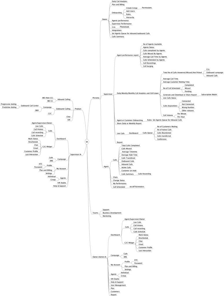
Information Architecture
Outlined the hierarchical organization of content and features to facilitate intuitive navigation for users.
UX UI design
Focused on User Efficiency:
The refreshed design prioritizes a minimal learning curve for all user personas. We implemented a clear and intuitive interface that can be understood and mastered quickly.
- Streamlined Workflows: Simplified navigation and role-specific dashboards allow users to locate functionalities quickly, minimizing the need for extensive training.
- Contextual Information: Crucial details like customer data are presented directly within relevant workflows, eliminating the need for users to search through different sections of the platform.
- Intuitive Interface: Common design patterns and clear visual cues ensure users can easily understand how to interact with the platform.
Enhanced User Experience with Visual Design:
We employed a clean, vibrant visual design to create a user-friendly and engaging experience.
- Clear Visual Hierarchy: A well-defined hierarchy guides users’ attention toward essential information and functionalities on the screen.
- Role-Specific Dashboards: Each persona benefits from a visually distinct dashboard tailored to their needs. This fosters a sense of familiarity and reduces cognitive load.
Impactful Design Decisions:
Key design choices significantly improved the user experience:
- Pop-Up Customer Details: During calls, relevant customer information surfaces within a pop-up window, eliminating agents needing to search elsewhere. This saves valuable time and reduces agents’ frustration.
- Interactive Dashboards: Interactive elements like clickable charts and graphs allow users to delve deeper into specific data points, fostering data-driven decision-making.
Content text
Content text
Content text
Design System
Color palette
A carefully chosen color scheme promotes a professional yet approachable feel, reflecting the platform’s focus on streamlined communication.
Primary #2D3688 | ◯ |
R 45 G 54 B 136 |
Primary #533EBB | ◯ |
R 83 G 62 B 187 |
Primary #1BC5BD | ◯ |
R 27 G 197 B 189 |
Tiffany Blue
Primary #F3F6F9 | ◯ |
R 243 G 246 B 249 |
Cultured
Typography
Typefase
Poppins
Usage
Headlines
Aà
Instead of utilizing contrast purely for the purpose of mitigating who are excited about unique ideas and help digital companies.
AaBbCcDdEeFfGgHhIiJjKkLlMmNnOoPpQqRrSsTtUuVvWwXxYyZz 0123456789
Typeface
Poppins Medium
Usage
Headlines
With more than 16+ years of experience, our team has become a leader in digital design and innovations.
Typeface
Poppins Regular
Usage
Headlines
Outcome
What did we achieve from this project?
- Increased User Efficiency: Streamlined workflows, contextual information, and intuitive design lead to faster task completion for Business Owners, Team Managers, and Agents.
- Improved Agent Productivity: Reduced time spent searching for information and simplified call management empower agents to handle calls more efficiently.
- Enhanced Customer Service: Faster access to customer details and streamlined call handling contribute to improved customer service experiences.
- Streamlined Communication & Collaboration: Role-specific dashboards and improved information sharing facilitate better communication and collaboration between team members.
- Data-Driven Decision Making: Interactive dashboards and readily available data empower managers and owners to make informed decisions based on call center performance metrics.
- Reduced User Error: Clear navigation, contextual information, and intuitive design minimize user errors and frustration while using the platform.
- Increased User Satisfaction: A clean, efficient, and user-friendly user interface enabled a more positive user experience for all user personas.
- Improved Brand Perception: A modern and consistent design reinforces brand identity and conveys professionalism to users.
- Scalability and Maintainability: The design system provides a foundation for future growth, allowing for easy integration of new features without compromising design consistency.
- Reduced Training Time: A minimal learning curve thanks to an intuitive interface minimizes the training time needed for new users to become proficient in the platform.
Testimonials
The Super Receptionist redesign is exceeding expectations! User feedback is overwhelmingly positive, praising the interface's intuitiveness and features like in-call customer pop-ups. It translates directly to happier customers for our clients, solidifying Super Receptionists as a leader in cloud-based communication solutions.
Aman, Product Manager