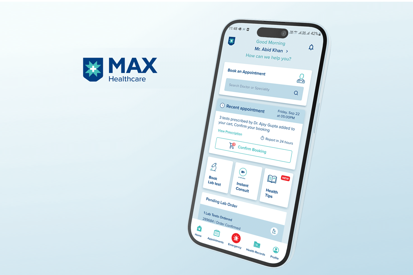
Max Healthcare Mobile App
Max Healthcare is a leading healthcare provider in India. They approached Unqode to add new features to their mobile app and also asked to revisit a few areas to improve the user experience where users were struggling. The Max Healthcare app is primarily used by patients to book medicines, lab tests, and doctor appointments. The mobile app had several usability challenges where users were finding it difficult to navigate. This was leading to frustration and low engagement. Our task was to redesign core features to make the health app easier to use, ultimately enhancing the patient experience and improving healthcare outcomes.
Task
Task Redesign the Max Healthcare mobile app to improve search functionality and profile management for personalized recommendations.
Strategy
Competitor Research Stakeholder Interviews User Personas
Design
01 Stakeholder Interview, 02 Wireframe, 03 UX/ Ui Design, 04 Prototyping
Client
Max Healthcare
Industry
Healthcare
Challenge
The primary objective of this redesign was to enhance the usability of the Max Healthcare mobile app. We have to identify the key pain points through user feedback and data analysis. Our focus was on improving the mobile app’s navigation and search experience, as well as making it easier for patients to book lab tests and health packages, manage profiles, and order medicines. Below are the specific goals that guided our design process:
⬤ 01. Enhance Navigation and User Flow
It would be helpful if the mobile app were easier for patients to navigate, reducing confusion when booking lab tests, health packages, doctor appointments, or ordering medicines.
⬤ 02. Improve Profile Management
⬤ 03. Optimize the Lab Test Booking Experience
⬤ 04. Personalize User Experience
⬤ 05. Improve Cart and Checkout Processes
Strategy
Research
User Persona
We have identified personas to keep our design focused on real patient needs.
Pankaj Kumar
Everyday User
Use the app to book medicine, Lab tests, and Doctor appointments for himself and family members
Deshant Bansal
MBBS Doctor
Doctors/hospitals have to pull the correct patient details by phone number
Agnivesh
Marketing and Sales Head
Businesses have to run campaigns on the targeted users.
Everyday User's Pain Points
Doctors/Hospital Pain Points
Marketing Head Pain Points
Wireframes
Design
Design Execution
Restructured Landing Page
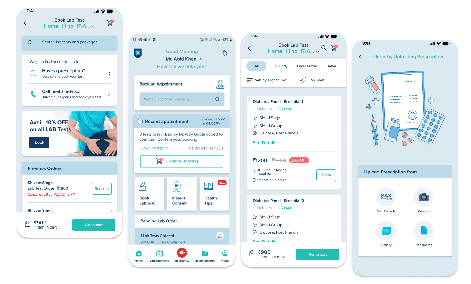
We have improved the home screen layout to create a more user-friendly experience. This helps patients easily locate and schedule lab tests, manage their profiles, and request medications.
Enhanced Search and Wellness Package Booking Experience
To improve the lab test booking experience, we have restructured the search results to display clear pricing and relevant details of Test and Wellness Packages. We also added personalized test and package recommendations based on user history, demographics, and popular choices to enhance the relevance of search results for better engagement.
Cart Recall & Checkout Flexibility
The cart now retains selected items even if the user leaves the app or navigates to other sections to make it easier to complete orders. Additionally, we introduced flexible slot selection for appointments, either before or after payment.
Designed Profile Merge Functionality
We have designed the profile merge experience to reduce the number of duplicate profiles. It leads to a better profile management practice in place, along with reducing transactional errors
Visual design
Outcome
What did we achieve from this project?
- Improved Navigation and User Flow: Patients find the app much easier to navigate, which leads to faster booking of lab tests and appointments and fewer support requests.
- Higher Patient Satisfaction With personalized recommendations and a smoother checkout process, user satisfaction has increased significantly.
- More Accurate Profile Data: The enhanced profile management system has reduced the creation of duplicate profiles, leading to cleaner data and improved operational efficiency for healthcare providers.
- Increased Engagement Clear CTAs, easier navigation, and personalized recommendations have led to increased user engagement, particularly in lab test bookings and wellness package bookings.
Testimonials
The updated app has made it so much easier for our patients to book tests and manage their profiles. The user experience is smooth, and we've seen fewer complaints about navigation issues. Also, it helped us in scheduling campaigns for target users
Agnivesh, Marketing, and Sales Head