Motion Cycling
Motion Cycling, a fitness training company in Abu Dhabi and Dubai, engaged our UX design agency to update their outdated product dashboard. We created a modern and user-friendly dashboard through collaboration with the client, user testing, and iterative design changes.
The redesign has allowed Motion Cycling to provide exceptional fitness training services and maintain its reputation for delivering high-quality experiences to its customers.
Task
Design and develop an intuitive backend dashboard for Motion Cycling to efficiently manage coach availability, class assignments, customer accounts, and equipment availability within a backend system and functionalities.
-
Strategy
Stakeholder Interview, User Persona
-
Design
Information Architecture, Visual design, Prototyping, Design system
-
Client
Motion Cycling, UAE
-
Technology
Html Css, Codeigniter, PHP
Goal
⬤ 01. Intuitive Navigation
⬤ 02. Effortless Booking
⬤ 03. Stay on Track
⬤ 04. Maximizing Trainer Availability
Strategy
Research
User Persona
Putting the User First: Created Detailed User Personas to Guide the Motion Cycling Dashboard Redesign

Amelie Hua
Owner
Streamline business operations and improve efficiency through the dashboard

Amelie Hua
Trainer
Manage schedules and availability through the dashboard

Amelie Hua
Customer
Receive timely notifications and reminders for credit expiration dates
Painpoints discovered
Complexity of System
The system is overly complex, especially for new users when they are unfamiliar with backend management tools, leading to frustration and difficulty navigating the interface.
Inefficient Coach Management
Coaches need more visibility into their schedules or have difficulty updating their availability, resulting in miscommunication or scheduling conflicts.
Tedious Class Assignment Process
Administrators find assigning coaches to classes time-consuming and prone to errors, particularly when managing last-minute changes or substitutions.
Customer Account Management Challenges
Managing customer accounts, including adding credits, tracking usage, and resolving inquiries, could be more convenient and prone to errors with a streamlined process in place.
Inadequate Equipment Monitoring
Users responsible for monitoring fitness bike availability need help identifying maintenance needs or allocating resources efficiently, leading to disruptions in class schedules.
Design
UX Design
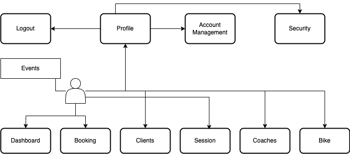
Information Architecture
Outlined the hierarchical organization of content and features to facilitate intuitive navigation for users.

Visual design
Motion Cycling has designed its visual interface to make it easier for owners and administrators to manage their operations. The design is clean and straightforward, allowing users to navigate the platform intuitively. Essential tasks such as scheduling coaches and managing customer accounts are streamlined to ensure swift action. The minimalist design elements and responsive layout enable quick comprehension and seamless performance across devices. These features empower owners and administrators to manage Motion Cycling’s operations efficiently and quickly.


Design System
Our design system for Motion Cycling is streamlined to prioritize clarity and efficiency. We consolidate key design elements such as colors, typography, and UI components, which ensures consistency and ease of use across the platform. We provide clear guidelines for buttons, forms, and layouts, which enable quick updates and development. This empowers the Motion team to maintain a cohesive user experience with minimal effort.
Color palette
| Primary #EC103E | ◯ |
| R 0 G 122 B 255 |
Magnetic Red
| Primary #EC103E | ◯ |
| R 88 G 78 B 157 |
Liberty
| Primary #1BC5BD | ◯ |
| R 27 G 197 B 189 |
Tiffany Blue
| Primary #F3F6F9 | ◯ |
| R 243 G 246 B 249 |
Cultured
Typography
Typefase
Beatrice Regular
Usage
Headlines
Aà
Instead of utilizing contrast purely for the purpose of mitigating who are excited about unique ideas and help digital companies.
AaBbCcDdEeFfGgHhIiJjKkLlMmNnOoPpQqRrSsTtUuVvWwXxYyZz 0123456789
Typefase
Beatrice Regular
Usage
Headlines
With more than 16+ years of experience, our team has become a leader in digital design and innovations.
Typefase
Beatrice Regular
Usage
Headlines
Outcome
What did we achieve from this project?
- A highly usable and visually appealing dashboard that met the needs of the owners, trainers, and customers.
- A new design system that ensured consistency, cohesiveness, and brand identity across all elements of the dashboard.
- A fresh and modern color palette that added visual interest and made the dashboard more engaging for users.
- Increased user engagement and satisfaction with the contact center
- Better accessibility and inclusivity for all users, regardless of ability or disability
- Positive feedback from users, indicating that the redesign was a success.
Testimonials
Our team at Motion Cycling is thrilled with the results of the redesign project. The new dashboard is visually stunning and highly functional, making it easier than ever for our trainers to navigate and access important information
Amelie Hua, Owner, Trainer


