Max Healthcare · New Delhi, India
Max Healthcare
Mobile App
Redesigning the patient-facing app for India's leading hospital chain — fixing search, booking, profile management, and personalisation for millions of users.
An app millions trusted — but that made simple tasks unnecessarily hard.
Booking a lab test, finding the right doctor, managing a profile — each should take seconds. Instead, patients were dropping off at every step. The problems weren't obscure edge cases; they were the core flows.
Navigation buried key features
Patients couldn't find lab tests or appointment booking without 4+ taps, causing high drop-off before users reached the actions they needed.
Search was too generic
No filters for location, doctor specialty, or package type. Users searching for a specific test or doctor had to scroll through unrelated results.
Checkout was confusing
Users couldn't select an appointment slot before paying, causing significant drop-offs at the most critical point of the booking funnel.
Duplicate profile problem
One phone number could generate multiple patient profiles, breaking medical records continuity and making marketing analytics unreliable.
No personalisation
Returning users saw the same generic home screen every time, regardless of their history — making the app feel unfamiliar even to frequent visitors.
Research first. Design second.
We spoke to patients, doctors, and the marketing team before touching a single wireframe. Three different personas revealed that the duplicate profile bug was everyone's problem — just with different consequences.
Research & competitive analysis
- Workshops with product managers to align on goals and constraints
- User interviews with patients, doctors, and the marketing team
- Competitive benchmarking against Apollo, Fortis, Pharmeasy, and NetMeds
- Identified key drop-off points across search, booking, and checkout flows
Persona-driven problem framing
- Three distinct personas: Pankaj (everyday patient), Dr. Deshant (doctor accessing patient records), and Agnivesh (marketing head running campaigns)
- Mapped each persona's pain points against the existing interface
- Identified the duplicate profile issue as a shared problem with three different consequences
- Prioritised fixes by impact and engineering feasibility
UX redesign
- Restructured home screen to surface the most-used actions
- Advanced search with filters for specialty, location, and package type
- Redesigned checkout with slot selection before payment
- Profile merge flow to consolidate duplicate accounts
UI & handoff
- Clean, accessible visual design consistent with Max Healthcare's brand
- Annotated Figma files delivered to the engineering team
- Two-week support window post-handoff for clarifications and edge cases
- Android-first delivery with iOS considerations documented
Seven flows redesigned from the ground up.
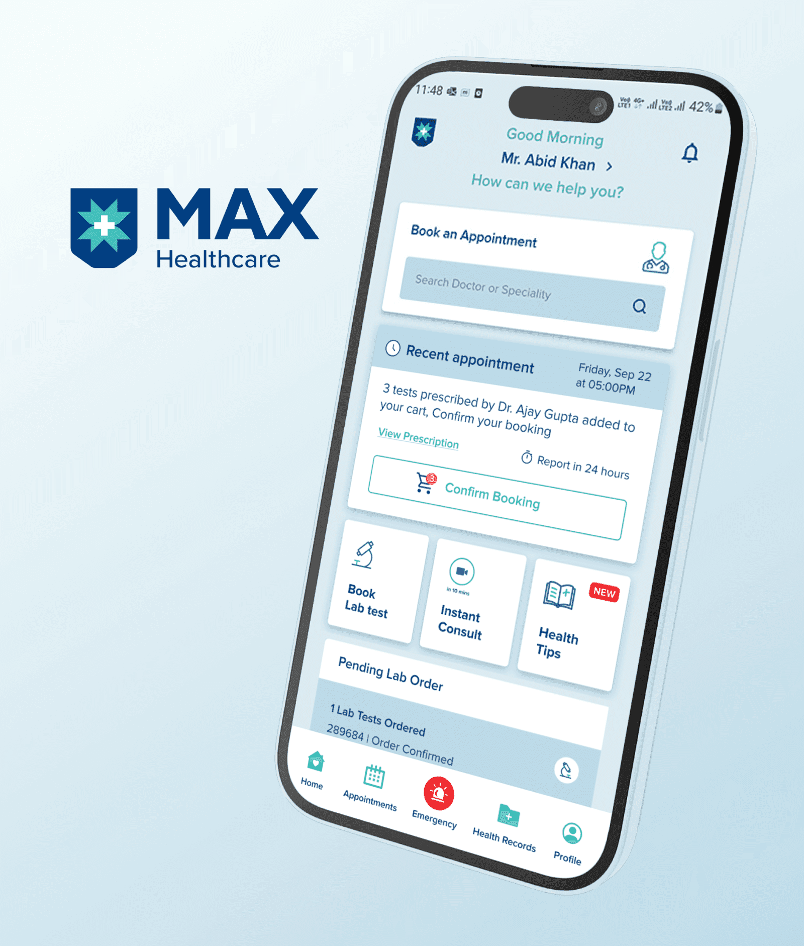
Redesigned home screen
Prioritised actions surfaced at the top level — lab tests, appointments, and wellness packages accessible within two taps.
Advanced search with filters
Search by specialty, location, and package type. Results are contextual and ranked by relevance.
Cart recall
Items persist after the app exits — users return to find their selections intact, reducing re-entry friction.
Flexible slot selection
Appointment slots can be selected before or after payment, removing the forced sequence that caused checkout drop-offs.
Profile merge flow
A clear, guided flow for patients to consolidate duplicate accounts — improving data quality for both medical records and marketing.
Personalised recommendations
Returning users see home screen content based on their history and demographics — relevant tests, nearby facilities, and upcoming health events.
Annotated Figma handoff
Fully annotated Android Figma files with interaction notes, spacing specs, and edge-case documentation for the engineering team.
Fewer complaints. Cleaner data. Higher bookings.
The redesign addressed the root causes — not the symptoms. Navigation that put the most-used actions within two taps, search that surfaced relevant results, and a checkout flow that matched how patients actually think about booking.
The profile merge flow had a second-order effect beyond UX — it gave the marketing team reliable data to run targeted campaigns, something they hadn't been able to do confidently before.
Navigation complaints dropped post-launch as patients could find lab tests and appointments without assistance.
Duplicate profile creation reduced significantly, giving the marketing team reliable data for targeted campaigns.
Lab test and wellness package conversions improved after the checkout flow was redesigned around slot selection.
"The updated app has made it so much easier for our patients to book tests and manage their profiles. The user experience is smooth, and we've seen fewer complaints about navigation issues. It also helped us schedule campaigns for target users."
Next case study