
What a UX Audit Actually Finds: Real Problems From 40+ B2B SaaS Audits
Most UX audit reports run to 40 or 50 pages and take weeks to produce. After auditing more than 40 B2B SaaS products, the same problems appear again and again — in different interfaces, different industries, different tech stacks. Here is what we actually find, and what it costs when it goes unfixed.
The Recurring Problems Nobody Talks About
When we deliver a UX audit, clients often expect a list of things their design team already knows about — the broken mobile flow, the help text that was never written, the onboarding modal everyone admits is confusing. Sometimes those are in there. More often, the problems that actually move metrics are the ones nobody noticed because they are structural rather than cosmetic.
After running audits across more than 40 B2B SaaS products — from early-stage tools with a few hundred monthly active users to enterprise platforms handling tens of thousands — certain problems appear so consistently that we have stopped being surprised by them. They cut across industries, team sizes, tech stacks, and funding stages. They are the default failure modes of software built by people who know the product too well to see it as a new user does.
This is what we actually find.
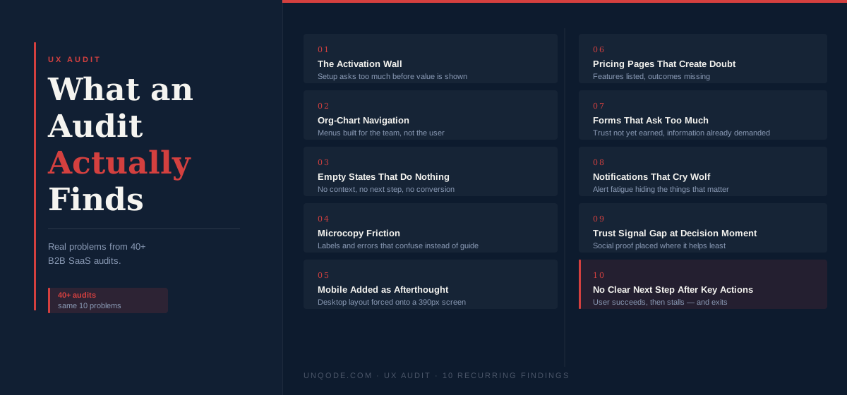
1. The Activation Wall
The most common conversion problem in B2B SaaS is not bad marketing or weak product-market fit. It is an activation wall — a point in the new-user journey where the product asks for something the user is not yet ready to give.
The form is almost always the same: a multi-step setup flow that requires users to configure integrations, invite teammates, or make architectural decisions before they have experienced any value. Completion rates on these flows, on an absolute basis, are below 30% in the majority of products we audit. In some cases they are below 15%.
The fix is not a shorter form. It is rethinking what "setup" means. The user's goal on day one is not to configure your product — it is to experience the thing your product promised them in the marketing. Everything in the setup flow that delays that experience is friction against conversion.
We find activation walls most often in CRM and sales tools, project management products, HR platforms, and any SaaS that requires data import before the product can demonstrate value.
2. Navigation That Reflects the Org Chart
B2B SaaS products are built by teams. Teams have structures. Those structures — engineering divisions, product areas, historical decisions about what belongs where — end up reflected in the product navigation in ways that make sense internally and confuse users completely.
We call this org-chart navigation: a menu that groups features by who owns them internally rather than by what a user is trying to accomplish. The "Reports" section contains analytics built by the data team. The "Settings" section contains pricing, permissions, and integrations because they were all added by the platform team. The "Admin" area contains things that non-admins need daily, because the admin panel was built first and everything got bolted to it over time.
Users do not know your org chart. They know what they are trying to do. When navigation maps to the former rather than the latter, users spend 20–40% of sessions looking for things rather than doing things. In session recordings, this looks like users hovering over nav items without clicking, entering sections and immediately backing out, and using search to find things that should be three clicks away.
Navigation built around your team structure is an internal map disguised as a user interface. It tells you where things live, not where users expect to find them.
3. Empty States That Do Nothing
Every SaaS product has empty states — the screens that appear before a user has added data, created a project, or connected an integration. These are some of the most conversion-critical screens in the product, and they are almost universally underdesigned.
A bad empty state says: "No projects yet. Create your first project →"
A good empty state says: here is what this section does, here is an example of what it looks like when it has data, here is the single thing to do next — and here is why it matters.
The difference in activation rates between these two patterns, across audits where we have had access to before-and-after data, runs between 15% and 40%. That is not a marginal improvement. That is the difference between a product that works for new users and a product that does not, for users who never received enough context to understand what they were looking at.
We find poorly designed empty states in literally every product we audit. It is the single most reliable finding.
4. Microcopy That Adds Friction
Most product teams treat copy as a finishing step — something that gets filled in when the design is "done." The result is button labels, field names, error messages, and helper text written under time pressure by engineers or designers who are not writers, describing features in terms of what they do rather than what the user gets from them.
Common examples we encounter: "Submit" on a form that sends a message to a human being (it should say "Send message" or "Book a call"). "Invalid input" as an error message (it should say "Please enter a valid email address"). "Process" and "Pipeline" used interchangeably in the same product to mean different things. "Learn more" linking to documentation that is 4,000 words long with no indication of what is in it.
Microcopy problems are individually small. Cumulatively, across a full product, they add up to an experience that feels built by engineers for engineers — technically accurate but not designed for the person actually trying to use it. The trust cost compounds: users who encounter one confusing error message approach the rest of the product with slightly more hesitation.
5. Mobile That Was Added Later
In B2B SaaS, mobile is usually an afterthought. The product was designed for desktop, and mobile support was added by making the desktop layout responsive — without rethinking the experience for a different context, screen size, and interaction model.
The audit signature for this is specific: desktop tables that scroll horizontally on mobile with no indication that there is more content to the right; modals that are taller than a phone screen; tap targets sized for a cursor rather than a finger; input fields that trigger automatic zoom on iOS because the font size is below 16px.
In products where clients share analytics, mobile accounts for 20–40% of sessions. A product that handles mobile poorly is losing or frustrating a significant share of its users every day — including decision-makers reviewing the product on a phone before a meeting or while commuting.
6. Pricing Pages That Create Doubt
Pricing pages are the highest-intent page on most SaaS marketing sites. Users who reach the pricing page are actively evaluating. The job of that page is to answer the question "is this worth it for someone in my situation?" clearly and without hesitation.
Most pricing pages fail by: hiding the most popular plan's price behind an annual-only toggle that defaults to annual; describing plans in features rather than outcomes; using "custom pricing" or "contact us" for anything above a certain tier without explaining why; and placing differentiating features at the bottom of comparison tables, below the fold, in rows that look identical to each other.
We also find a specific pattern we call the Trust Vacuum. The testimonials are on the homepage. The case study is on the work page. The pricing page itself — where the purchase decision is made — has no evidence that anyone has paid this amount and been satisfied. Social proof is concentrated where it is least needed and absent where it is most needed.
7. Forms That Ask Too Much, Too Early
This applies to both sign-up forms and in-product forms. The pattern is consistent: a form was designed to collect information the team wanted, without accounting for what the user is willing to give at that moment of trust.
Sign-up forms with more than email and password lose statistically significant volume before any value exchange has occurred. In-product forms asking for company size, job title, or phone number before the user has experienced the core feature show abandonment spikes at those specific fields — visible in heatmaps as exactly the point where users stop.
The fix is staged collection: ask for the minimum required to provide value, then ask for more when you can offer something in return. "What does your team mainly use this for?" is a reasonable onboarding question after the user completes their first task — because at that point they have something to tell you and a reason to trust you with the information.
8. Notifications That Cry Wolf
Products that have grown feature sets over time almost always have a notification system that has expanded in parallel. Every feature team adds their alerts. Every product manager wants their feature visible. The result is a notification centre — email, in-app, or both — that is so active it trains users to ignore it entirely.
This becomes a serious operational problem when a notification actually matters. Trial expiry warnings, payment failures, security alerts, and retention-critical feature announcements get buried under low-priority system updates. We have audited products where the email unsubscribe rate from product notifications exceeded 30% — meaning nearly a third of the user base had opted out of all communication, including the things they genuinely need to know.
The fix is a notification hierarchy: a small number of genuinely urgent types used rarely enough to retain attention, and an explicit downgrade of everything else to a digest format or a passive log the user can check when they choose to.
9. The Trust Signal Gap at the Decision Moment
This applies specifically to marketing sites. Most B2B SaaS websites concentrate trust signals — testimonials, client logos, case study results — in a dedicated section below the hero, then route users through product screenshots and feature descriptions toward a final CTA with no trust signals nearby.
A user who scrolls past the testimonial section does not carry that trust mentally all the way to the contact form. By the time they reach the conversion action, they are operating on whatever impression has built up — which may or may not include the evidence that justifies the decision they are being asked to make.
The highest-leverage trust signal placement, in our experience, is immediately adjacent to the conversion action: a short testimonial beside the sign-up form, a logo strip above the "Book a call" button, a case study result inline with the pricing plan it validates. This is not about adding more social proof. It is about placing the existing proof where decisions are actually made.
10. No Clear Next Step After Key Actions
What happens after a user completes a meaningful action — signs up, finishes onboarding, exports a report, connects an integration? In most products we audit, the answer is: they land back on the dashboard, which looks exactly as it did before the action was completed.
Success states that do not indicate what to do next are a consistent source of drop-off. A user who has just connected their first integration and lands back on the main dashboard with no prompt about what to explore will often exit — not because they are disengaged, but because they have no obvious next step and are reluctant to make a wrong decision by guessing.
The fix is a lightweight success moment: acknowledgement of what just happened, a brief explanation of why it matters, and a single clear prompt for the logical next action. This does not require a tooltip tour or a full onboarding checklist. It requires thinking about what a user should do next at each key milestone and surfacing that answer at the right time.
What These Problems Have in Common
All ten of these findings — and the dozens of others that appear less consistently — have the same root cause. They were built by people who already know the product. Knowing the product creates blind spots: you stop seeing the onboarding flow as a new user sees it because you navigate it with expert knowledge. You write microcopy in the language of the system because you understand the system. You design empty states assuming users already know what the feature does, because you do.
A UX audit is, at its core, a structured process for seeing your own product as an outsider sees it — with the added step of connecting what that outsider experiences to the metrics that reflect their confusion.
If you want a quick version of this for your own site, our AI Website Roast surfaces ten specific UX problems in under a minute, with severity ratings and the conversion impact of each — no login required. For a conversion-specific diagnosis, the AI Conversion Doctor runs the same analysis focused on revenue. And if you want to put a number on what these problems are likely costing each month, the Revenue Leak Calculator does exactly that.
If the number warrants a proper conversation, we offer a free 30-minute call — no pitch, no deck, just an honest look at your specific situation.
AI Website Roast
See what a quick version of this looks like for your site — 10 specific UX problems with severity ratings in 30 seconds. No login required.
Written by
Founder & CEO
Founder of Unqode. Fifteen years designing B2B SaaS, healthcare, and fintech products for teams across India, the UK, and North America.
View all articles

Want us to audit your product?
Book a free 30-minute call and we will tell you exactly what to fix first.
Book a free call