
SaaS Onboarding UX: 8 Patterns That Turn Free Trial Users Into Paying Customers
Most SaaS products lose 60–80% of trial users before they ever reach the aha moment. The problem is rarely the product itself — it is the path to value. Here are eight onboarding UX patterns, drawn from audits across 40+ B2B SaaS products, that consistently improve activation and trial-to-paid conversion.
The Activation Problem Nobody Talks About
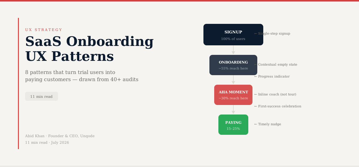
The industry average trial-to-paid conversion rate for B2B SaaS sits between 15% and 25%. That means three out of every four people who sign up for a free trial — people who already found your product, clicked your ad or referral link, entered their email, and made the deliberate decision to try it — never become customers. They signed up and left.
The default assumption is that they were not the right fit. Wrong product, wrong timing, wrong price point. That is sometimes true. But in the majority of cases we have seen across forty-plus B2B SaaS onboarding audits at Unqode, the product was perfectly right for the user. The onboarding experience was not.
Activation — the point at which a user experiences the core value of your product for the first time — is the most important metric almost no SaaS product optimises properly. Everyone optimises for signups. Almost nobody optimises for what happens in the forty-eight hours after.
This article covers eight specific UX patterns, drawn from real audit findings, that the best-converting B2B SaaS onboarding flows share. None of them require a full redesign. All of them can be tested in days.
Pattern 1: The Single-Step Signup with Deferred Data Collection
The most common onboarding mistake we see is asking for information before the user has any reason to trust you with it. Eight-field signup forms. Company size dropdowns. Phone numbers. Job title. Use case selection. All before the user has seen the product.
Every additional field in a signup form reduces conversion. This is not a hypothesis — it is one of the most consistently replicated findings in e-commerce and SaaS research. The friction is not just mechanical. Asking for information before delivering value signals a transactional relationship where the user is giving something (their data, their time, their attention) before receiving anything in return.
The pattern that works: reduce the signup form to the absolute minimum required to create an account — typically email and password, or a single OAuth button — and defer all profiling to within the product experience, where it can be contextualised as serving the user rather than qualifying them for your marketing database.
A workflow tool we audited in 2025 had a seven-step signup sequence before users saw any product interface. Reducing it to two steps — email and password — and moving the profiling questions into the first-run experience (framed as personalisation) increased signup completion by 61% and did not reduce the quality of leads reaching the product.
Pattern 2: The Contextualised Empty State
Empty states are the most underdesigned screen in most SaaS products. When a user enters a new product for the first time, every list is empty, every dashboard is blank, every feed is silent. The default response in most products is to show an icon and text that says "No items yet. Create your first one."
This is a failure of empathy. A new user in an empty product has no mental model of what this space should look like when it is working. They cannot picture the end state. They do not know what "creating their first one" will involve, how long it will take, or whether doing so will unlock value or just create more work.
The pattern that works: empty states that show an example. Not a generic illustration, but a realistic mock record, mock project, mock dashboard — populated with representative data that shows the user what the product looks like when it is doing the thing they signed up for. This transforms the empty state from an invitation to do work into a demonstration of value.
Pair this with a single, contextual CTA that explains what the first action will produce, not just what it is. "Start your first project" tells the user nothing. "Start your first project — takes 2 minutes, shows you how the dashboard updates in real time" tells them what they will get for the effort.
Pattern 3: The Aha Moment Acceleration
Every SaaS product has an aha moment — the first point at which a user genuinely experiences the value they signed up for. For a project management tool, it might be the first time they see their team's tasks updating in real time. For an analytics platform, it might be the first time they see their own data in a chart. For a CRM, it might be the first time they see how a deal pipeline automatically updates from email activity.
The critical finding from activation research is this: the faster a user reaches the aha moment, the more likely they are to convert. Not slightly more likely — significantly more likely. Slack's internal research found that users who sent a certain number of messages in their first week were dramatically more likely to remain customers. The number became an internal activation target the whole company optimised for.
Most SaaS products do not know what their aha moment is. They have never mapped the path from signup to first-experienced value. If yours is not mapped, that is your first task.
Once you know the aha moment, audit every step between signup and that moment. Ask of each step: is this step necessary to reach the value? If not, cut it, defer it, or pre-fill it. The goal is the shortest possible path from signup to genuine value experienced.
A sales intelligence SaaS we worked with had an activation sequence of eleven steps before users saw their first enriched contact record — the value the entire product was built to deliver. Eight of those steps were optional setup tasks surfaced as required. Reordering the sequence to show enriched data first, then invite setup, reduced time-to-aha by 74% and increased seven-day retention from 31% to 52%.
Pattern 4: The Personalised Onboarding Path
A single onboarding flow that treats a solo founder, an enterprise IT manager, and a freelance consultant as equivalent users will serve all three of them poorly. These users have fundamentally different goals, different technical comfort levels, different time constraints, and different definitions of value from the same product.
The pattern: a brief, frictionless segmentation at the start of the onboarding experience — two or three questions, framed as personalisation rather than qualification — that routes users into different first-run experiences. The questions should be about the user's goal or role, not about your product tiers.
The key design principle here is that the questions must feel like they serve the user, not you. "What is your team size?" serves the vendor. "What is the first thing you want to accomplish?" serves the user. Both might route users the same way internally, but the second creates goodwill; the first creates the sense of being processed.
The personalised path does not require building three entirely different products. Often it means: showing a different set of suggested first steps, highlighting different features in tooltips, and pre-populating a different example project. The structural investment is modest. The impact on activation is significant.
Pattern 5: The Progress Indicator with a Defined Endpoint
Onboarding without a visible end is psychologically exhausting. Users do not know how long setup will take, which makes every additional step feel potentially infinite. The Zeigarnik effect — the human tendency to remember and be motivated by incomplete tasks — works in your favour only when the user believes completion is achievable and near.
The pattern: a visible progress indicator that shows both how far the user has come and exactly how many steps remain to the defined completion point. "Step 3 of 5" is functional. A progress bar that fills as steps complete is better. A checklist with completed items checked off and remaining items visible is best — because it creates both a sense of accomplishment (what is already done) and clarity about what remains.
The endpoint must be defined by the user reaching a moment of value, not by you collecting all the information you need. "Your account is set up" is a vendor-centric endpoint. "Your dashboard is ready" is a user-centric endpoint. The difference affects whether users feel they have arrived somewhere worth being.
Pattern 6: The Timely, Contextual Nudge
Most SaaS onboarding email sequences are built on arbitrary time intervals. Day 1: welcome. Day 3: tips. Day 7: check-in. Day 14: "We noticed you haven't logged in." These sequences were designed for the average user. There is no average user.
The pattern that outperforms time-based sequences is behaviour-triggered communication. A user who completed setup but has not created their first real record needs a different message than a user who has not completed setup. A user who imported data but has not used the main feature needs to hear something different from a user who explored the feature but did not complete the action.
Behaviour-triggered nudges are more relevant, more timely, and less likely to feel like spam because they respond to what the user actually did rather than how many days have elapsed on a calendar. They require more upfront investment in defining trigger conditions, but the payoff in activation rate is consistently significant.
For teams who cannot implement full behavioural triggers immediately: even breaking your welcome sequence into two paths — users who completed setup and users who did not — and sending different Day 3 messages to each group will outperform a single sequence sent to everyone.
Pattern 7: The Inline Coach, Not the Forced Tutorial
The forced product tour — the fullscreen overlay that walks users through every feature sequentially, blocking all interaction until the tour is "complete" — is one of the most reliably counterproductive patterns in SaaS onboarding. Users click through it as fast as possible to get to the product. It teaches nothing because there is no context: the user has not yet tried to do anything, so they do not know what they need to learn.
The pattern that works: contextual tooltips and inline guidance that appear when — and only when — they are relevant to what the user is attempting to do. The user tries to create their first record. A tooltip explains what a required field is for. The user opens the settings panel. A brief explanation clarifies what the most confusing setting does. The user reaches a feature they have not used. A small "New" badge or inline coach mark appears — not a fullscreen interruption.
This approach respects user agency. It treats the user as someone who can explore a product and ask for help when they need it, rather than someone who must be taught everything before being trusted to act. Users respond to being treated with respect by actually engaging with guidance — because they chose to, rather than because they had no other option.
The best onboarding feels less like a tour and more like a knowledgeable colleague who answers questions when you ask them, and knows when to stay out of the way.
Pattern 8: The First-Success Celebration
Activation research consistently finds that users who experience positive reinforcement after their first meaningful action are significantly more likely to return. This is straightforward behavioural psychology — rewarding a behaviour increases the probability of repetition — but it is implemented in almost no SaaS products.
The first success moment — completing setup, creating a first record, running a first report, sending a first message — should be explicitly acknowledged. Not with a confetti animation that becomes annoying after the first time, but with a genuine confirmation that communicates: you did the thing, here is what just happened, and here is what you can do next.
This accomplishes three things simultaneously. It confirms that the action worked (reducing anxiety for new users uncertain about whether they did it right). It reinforces the value created (connecting the action to the outcome). And it provides a clear next step (reducing the blank-canvas paralysis that causes users to close the tab and not return).
The next step should be the most natural progression from the action just completed, not a generic "explore the dashboard." If the user just imported their contact list, the next step is "see your contacts" or "send your first message to a contact" — not "explore other features."
Measuring Onboarding UX Performance
None of these patterns should be implemented without measurement. The key metrics for onboarding UX performance are:
- Signup completion rate: the percentage of users who begin the signup process and complete it. Below 60% suggests significant friction in the signup flow itself.
- Time-to-aha: the median time from account creation to first meaningful value experienced. You need to define what "meaningful value" means for your product specifically — this is not a metric you can pull from analytics until you have mapped the aha moment.
- Day-1 activation rate: the percentage of new users who complete at least one meaningful action on the day they sign up. Users who complete no meaningful action on Day 1 have very low Day-7 retention in every product we have audited.
- Day-7 and Day-30 retention: the percentage of users still active one week and one month after signup. These are the leading indicators of trial-to-paid conversion for most B2B SaaS products with 14–30 day trial periods.
- Onboarding completion rate: the percentage of users who complete the defined onboarding checklist or flow. Low completion is not always a problem — if users are skipping to value and staying active, that is fine. It is a problem if users who do not complete onboarding also do not retain.
Correlate these metrics against each other. The insight is not in any single metric but in the relationships between them. Users who reach the aha moment within 24 hours retain at what rate? Users who complete the onboarding checklist but do not use the core feature within 7 days — what happens to them? This correlation work is where the real activation insights live.
A Note on Complexity and Context
Some B2B SaaS products are genuinely complex. An enterprise data integration platform cannot be fully activated in a 10-minute onboarding session. A clinical workflow tool for hospital staff requires IT configuration before any clinical user can interact with it. These are real constraints that limit how fast any onboarding UX can move a user to value.
But even in these contexts, the patterns above apply at the level that is controllable. The enterprise sales-assisted onboarding still needs a clear definition of what the customer will experience at each stage of implementation. The IT configuration flow still needs a progress indicator and a defined endpoint. The first moment a clinical user logs in still needs to show them something valuable, even if the full configuration is not yet complete.
Complexity is not an exemption from good onboarding UX. It is an argument for investing in it more carefully, because the cost of a clinical user abandoning a product is measured in patient care outcomes, not in MRR lost this quarter.
Where to Start
If you are reading this and recognising gaps in your own onboarding, the most useful first step is not immediately implementing all eight patterns. It is mapping your current flow against your activation data.
Identify your aha moment. Map every step between signup and that moment. For each step, check: is it necessary? Is there friction that can be reduced? Does the user understand why they are doing it and what they will get? Then look at where you actually lose users in your analytics and session recordings — that is where to start fixing.
The eight patterns in this article are not a checklist to implement sequentially. They are a toolkit to apply surgically to the specific steps where your data says users are leaving. The audit-then-fix approach works for onboarding for the same reason it works for the rest of the product: you cannot optimise what you have not measured, and you cannot measure what you have not defined.
Onboarding Flow Grader
Describe your onboarding flow step by step and get a drop-off risk score per stage — with specific fixes for each weak point. No screenshots needed.
Written by
Founder & CEO
Founder of Unqode. Fifteen years designing B2B SaaS, healthcare, and fintech products for teams across India, the UK, and North America.
View all articles
Want us to audit your product?
Book a free 30-minute call and we will tell you exactly what to fix first.
Book a free call